Saturday, April 4, 2009


Sunday, March 22, 2009
Light Switch Electrocutes You Greener

Do you really need that light on to not trip over your coffee table and break your leg? Let's find out, shall we? The Consumption Feedback Switch is a device that monitors your electricity usage. If it feels you're within your light quota when you flip on the lights, you'll see a small, harmless spark. But if you've been one of those dolphin-unsafe villains from Captain Planet, reading a few minutes too long at night, a gigantic stream of deadly electricity will mend your ways pending you not die.
Alright, we're actually not sure that you feel a shock at all since the word "spark" may have been the choice of a liberal Google translation denoting "small glow." But we'd recommend keeping wasteful electrical usage down just in case. [product via dvice]
Thursday, March 19, 2009
EnergyHub: A Simple Solution for Energy Efficiency

One of the many barriers that impedes us from living a greener life at home is the lack of any simple and reliable way to gauge how much energy we are consuming. We can turn off our lights and computers, but we are still kept in the dark as to our true levels of our consumption. As price and demand for energy continue to climb, it becomes that much more important to have access to vital information about our energy use, which is exactly what the EnergyHub hopes to provide.
While some may opt for a simpler lifestyle with less energy use, for the most part people are going to continue on their current path of energy consumption, if not increase it. Founded by a team of former robotics and aerospace engineers, EnergyHub's array of software and hardware looks to bring a sense of control to consumer's homes.
To do this they're focusing on a key point in reigning in our energy consumption: the access to information. When we are able to accurately read and monitor our own consumption we will be able to take action. By giving 「home consumers an immediate, accurate and complete picture of their electricity usage」 EnergyHub hopes to reduce home energy usage by up to 20%.
The EnergyHub dashboard allows households to set monthly energy targets and gives detailed information about current consumption levels. It's information can also be accessible from the internet, and users will be able to compare data with neighbors and peers.
There's something to be said for tapping into our competitive nature to get those energy levels down! People could take a cue from mpg-stretching Prius drivers and strive for the lowest possible level of energy use.
Tuesday, March 17, 2009
POWER POINT
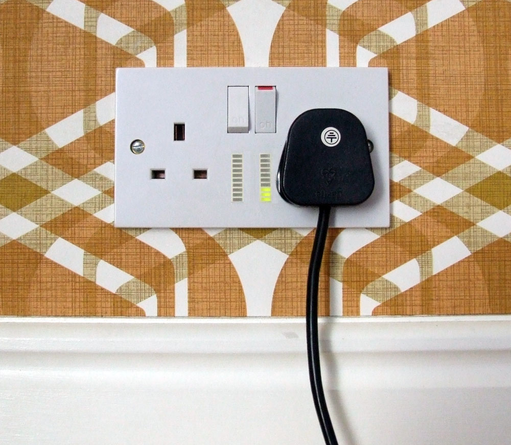
Power Point is designed to make visible the amount of power being consumed
by each mains socket in a direct and immediate way.

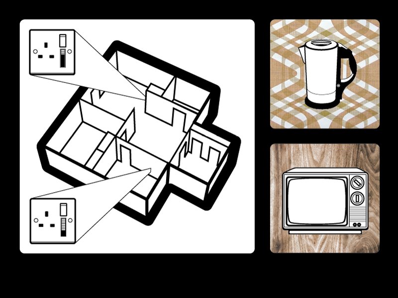
by creating awareness of how much power individual appliance draws.
Leading users to re-evaluate how they consume power.
Monday, March 16, 2009
Energy Consciousness
Do you know how much energy you use? Most of us don't. Sure we have meters outside some where but those gauges only mean something to the trained city technicians that come by once a month. For the rest of us, we need something else that translates energy usage into laymen's terms. Perhaps something like the Power Conscience.
It's a simple device that gives you up to the minute stats on your energy usage and calculates your current electric bill. Designer Delroy Dennisur could have stopped right there but he decided to take it a step further and give you a purdy visual cue. The front panel is laden with LEDs forming a floral pattern. The more energy you use, the more light is emitted as if the florals are growing.
Personally I think the opposite should happen. The florals begin to recede the more energy you use. A visual reminder to conserve.
Designer: Delroy Dennisur


Energy AWARE Clock

Energy AWARE Clock shows energy consumption for the whole household in real-time. This way, people become aware of how much electricity is consumed right now and can compare it to history consumption.
A traditional electrical meter is hidden in the basement or other places where people seldom look. Energy AWARE Clock is designed to make energy awareness a part of everyday life.
Yesterday's graphs fade away slowly and today's consumption is drawn on top of previous days, making it possible to compare energy use for several periods.
Energy AWARE Clock is wirelessly connected to an energy meter and can be integrated into mobile objects.
Project team: Loove Broms, Karin Ehrnberger, Sara Ilstedt Hjelm, Erika Lundell, Jin Moen.
Spark Lamp sparks energy consciousness

Conservation of energy and switching to alternative sources are two separate things. Or are they? Spark Lamp by Beverly Ng combines both and thus is a clear winner on the sustainability front. It is a lamp that runs on solar energy and thus teaches sustainability. Replete with symbolism, it seems to have been modeled on a plant. And like a plant, it collects sun's rays during the day to emit light at night. This simplistic design is actually quite a high-tech product. It has 1 RGB LED, and also comes equipped with Wi-Fi and tilt switch with biopolymers casing for protection against breakage. The Wi-Fi bit is actually a response to Swedish initiative to endow homes with smart meters that provide real-time info about energy consumption to the users over the internet. Spark Lamp encourages the initiative by incorporating the feedback on the lamp itself. Users feed their energy targets onto a computer
and as soon as the lamp is switched on, it extracts the current status from the system
. Thereafter it displays user's performance as red-below target, yellow - on target, green - above target. This happens for a mere 3 seconds, before the Spark Lamp starts emitting the normal white light. Spark Lamp seems just the right concept to egg on the green movement. More images after jump.


Sunday, March 15, 2009
wattson energy display
a physical ambient visualization device that displays the amount of energy that is spend in a household. the device consists of 2 parts: a sensor near the home's energy supply that measures how much power is consumed & a wireless display that conveys this information numerically & by brightness level. as colored lights & patterns shine through the material, the device can be used as more than just an energy monitor, for instance as an 'intelligent' mood light in the evenings or a 'last check' when leaving the house.

Cellphone Disco
an installation made out of flashing cells that is capable of visually revealing the electromagnetic waves of mobile phones. the lights are triggered by sensors that detect electromagnetic radiation of active mobile phones in a range of approximately 1 meter. this way, a sort of shadow or aura appears around the phone conversations, revealing a part of it's invisible body. other, less sensitive, sensors act as an inkless marker. the LEDs get activated only by an extreme proximity of the electromagnetic source. moving the phone close to the cells therefore leaves a trace of light, an electromagnetic drawing.
see also skyear & ambient blushing light & matrixx & memory wall & cellspace & biowall.

ambient phone

a collection of mobile phone applications that visualize information ambiently. the 'Solar System' application uses planets moving around the sun, in which each planet represents 1 communication partner & the size & velocity of the planet reflect the communication events. in 'Aquarium' uses fish to represent communication partners, & the size of the fish reflects the money the user spent on communication with this person. in 'Bubbles', each circle is a person & the size & speed of the circle represents communication meta-information with this person.
Information-augmented power socket

an information-augmented power socket that makes visible the amount of power being consumed by each mains socket in a direct & immediate way. this visualization is intended to change patterns of power use by creating awareness of how much power individual appliance draws, leading users to re-evaluate how they consume power. see also power aware cord & standby energy visualization.
[sciencearts.blogspot.com|thnkx Chris]
vision energy sculpture
a dynamic ecological sculpture designed as an "artistic barometer for resource efficiency". the concept proposes to place data-driven dynamic artifacts in public & private space that continuously represent the consumption of water, electricity & organic fuels. according to the designers, by representing such normally invisible processes, an emotional connection is made that leads to a higher awareness of the energy issue in society.

this project was selected as 1 of the very few finalists at the prestigious 2007 BrainPrize competition.
[link: braunprize.com & hfg-gmuend.de]
Ford's New Prototype Dashboard Concept

Business Week [businessweek.com] reports about the latest prototype dashboard concept developed together with Smart Design: giving drivers a wealth of information in an enticing format without confusing or, worse, distracting them, proved challenging. Complex graphs or fuel usage timelines were ignored in favor for more iconographic alternatives: "Fuel gauges, for instance, are represented by an image of a tank filled with an oil-like yellow liquid".
User research discovered how drivers get obsessed with achieving a "high score", that is the lowest fuel usage. Therefore, fuel efficiency is represented by an "eye-catching rendering of curling vines blooming with green leaves: It's more than a decorative element; it's a data-visualization tool intended to change the way people drive. If a driver wastes gas by aggressively accelerating or slamming on the brakes, for example, the vine withers and leaves disappear. More leaves appear if individuals drive more economically." Even more, this "data visualization" dashboard will be available standard on all new Ford Fusion Hybrids.
Proposing such an abstract, let's say quite artistic (vine leaves? in a car?), data display is quite surprising. Is this the resurrection of the ambient display concept?
For an opposite approach, also see the post about the Lamborghini Reventón dashboard. Same topic also on The Wall Street Online, Take Apart, The Motor Report, and a lot of other car blogs. Via Flowing Data.
Wednesday, March 11, 2009
The effects of information on residential demand for electricity.
The energy-conservation effect of monitor-provided information implies that consumers may have overestimated their optimal levels of electricity consumption prior to the use of the monitor. Without information about electricity usage, consumers would have used more electricity. The use of the monitor may have made consumers be aware of how much electricity they overused. The more often consumers use the monitor, the more accurately they can estimate the optimal consumption of electricity. This effect of information on electricity consumption is considered to be socially desirable as long as additional costs of providing information are less than increased surplus of consumers and environmental benefits of energy conservation.
Saturday, March 7, 2009
Imprint, a Community Visualization of Printer Data : Designing for Open-ended Engagement on Sustainability
Zachary Pousman, Hafez Rouzati, John Stasko
Note at CSCW'08
This paper presents Imprint, a casual information visualization designed as a technology probe for seeding reflection on printing practices in the workplace. Imprint is situated in the printer room of the workplace, on a LCD screen, showing various information visualizations at intervals to engage users in their printing practices. The paper describes five of the existing eight visualizations, and the projects intends to build upon users' experience to create new visualizations (I like this methodology of building upon users' experience with existing open-ended technology, for more you can read the technology probes paper, Hutchinson et al. CHI 2003, or my paper at DIS, Riche et al. 2008).
The first visualization is a tag cloud showing the most popular words found in people's printouts. The second visualization is a bar chart showing how many times a member of the workgroup was mentioned in the printouts. The third visualization uses network analysis (PCA) to compute a distance between members of the workgroup based on the printouts, and displays this distance on a world map. The fourth visualization is a pie chart showing printer's activity (idle, single sided, double sided), and the associated cost. It also displays a heat map showing printer's activity per day periods. The fifth visualization provides the cost of operating the Imprint system.
The underlying idea of this project, which is ongoing at Georgia Tech, is to raising discussions about people's behaviors regarding printing. The Imprint system is an open-ended, provocative piece in that regard, allowing users to de-familiarize themselves with their current behavior. Users can print out visualizations presented by Imprint and use them to discuss, or share with others.
I like the fact that it aims at creating a social forum around sensible issues while maintaining playfulness. This is definitely something worth getting inspired from.
keywords: feedback technology, social norms, behavior change